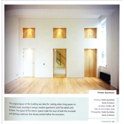
The book “150 Best Apartment Ideas” is interesting in that you get hundreds of images of apartments.
It is for visual people like architects and designers. Lots of visual stimulation and little text.
The book actually should have been called “150 Best MODERNIST FIRST WORLD Apartment Ideas”. After a while the apartments all blended together in one Modernist white blizzard of glass doors and untouched kitchens and 1st world sensibilities. Despite their huge variety they all had the same style.
This is partly because they were all apartments, which in itself is a pretty modernist thing. Modernist architecture isn’t really a country cottage sort of thing. It’s more a glass house in the city sort of thing.
Then there is the fact that they all had one thing in common – obviously – they are all apartments. And apartments, after having seen 150 of them sort of all look the same. The white square we call an apartment and then proceed to color and fill with junk until we feel we’ve made it unique is still a white square.
And the author seems to have a certain love of white squares – any apartment that isn’t – say an old Mediterranean apartment – is definitely not pictured in this book. And there definitely weren’t any AFRICAN apartments in this book. South American? Nope. The OTHER 99% of the world that lives in apartments would read this book and say, “Esto no es mi apartamento”.
So the book had lots of images of white squares with 1st world peoples junk in it organized and painted in their creative expression.
It is almost like you can hold all the pages and let them flip by really quickly and the only constant is the white square. The junk whirs by in an indistinguishable mish-mash but the white square remains crystal clear.
I guess what I’m saying is that when you put so many apartments in one book they loose their individuality. Each apartment is a beautifully crafted gem that took sweat and tears to create. Yet they have been lined up in a row and given a number. Somehow it was hard for me to feel the apartments
Oh and there’s the pesky fact that they negate the existence of 99% of humanity.
The other reason is that they all looked like they weren’t lived in. Or at the very most they are inhabited by elderly single interior designers who don’t cook and work all the time. The apartments lacked life.
I’m not saying I expected to see a crowded ghetto apartment. But these places looked more computer animation than brick and mortar. I wanted something I could connect to, to make the apartments look more like places built for humans. But again I think this was more the authors choice of apartments than any reflection of reality.
Lets just say these are Ana Caniizares’ 150 Best Apartment Ideas. It is her unique opinion and definitely not anything close to an attempt at showing universally good apartment ideas.
The apartments look like modernist purebred dogs, perfect in their design, following all the rules. But I like mutts. More character.
I’m not saying don’t buy the book if you are in the business of building. It might give you an idea for that client who wants to claim their white box. And the ideas are there. The book is full of stunningly designed apartments. Glorious places. All of them would be a joy for me to live in (if I could get over the fear of breaking anything).
But for me it didn’t really inspire me that much. It showed me what has been done in the world of interior white box design, not what is possible.
