Recently the City University of NY (CUNY) has developed a NYC Solar Map. The features of this map may very well create more opportunities for green contractors, like Eco Brooklyn, to increase installation projects. Many people may be surprised to hear that although the NY climate is nothing like the desert southwest, there are plenty of economically viable opportunities for solar PV to help green the city. For comparison, on an average day in NYC the sun is shining 58% of the time, on an average day in Tucson the sun is shining 85% of the time, and on an average day in Seattle the sun is shining 47% of the time.
They started the mapping in 2010 when a twin-engine strike commander began its many low altitude passes over the city in an attempt to gain precise three-d building and landscape information with a high tech laser system. This information would be used to create maps of flood prone areas (which we hope to use in our landscaping and cellar waterproofing work), and more pertinent to Eco Brooklyn, to create a map that is detailed enough to determine the amount of usable solar PV space on every building in NYC.
Now that the map is finished, it is truly amazing what it is able to calculate, although we did find some glitches. Some key features are the shade calculations of a site, an analysis of the greatest amount of solar PV that can be on a roof, how much that will cost after all government benefits are taken into account, and how long it will take the system to payback its initial start-up cost.
Maybe because the Eco Brooklyn roof has a green roof, or because of some mistaken shading issues (it’s unclear why on the CUNY website), the Green Show House is listed as a site that is not ideal for solar. This raises concern for us as to the accuracy of the Solar map since we know the Show House roof is ideal for solar panels, but we have not looked into why there is this discrepancy.
The house next to the Green Show House is identical in terms of solar gain and does not have this issue on the CUNY site, so we will use this rooftop for our example.
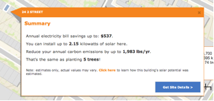
The figure above shows what you can get out of the maximum available solar PV capacity on the particular roof. In this example a 2.15 KW PV array will allow for a savings of $537 per year.
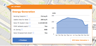
The figure above shows the exact amount of roof space that can be dedicated to solar and what that energy production would look like throughout the year.
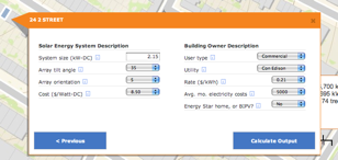
This figure above is the step where the user can decide what size and orientation of array they will be using. This step is curiously lacking a PV type or efficiency variable, which takes some legitimacy away from this system. As most environmentalists know, there are many different types of solar PV (1st Gen. mono and poly crystalline, and various 2nd Gen. types) that are available and have performances anywhere from 7% efficiency to upwards of 18-20%. Looking into the assumptions section of the website this issues is still not addressed.
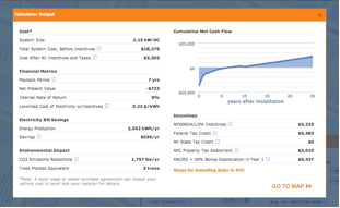
The figure above contains the calculations based on the given assumptions. Here CUNY has included solar rebates and incentives into the economic calculations, and have been able to create a payback period chart. This simple payback period is the bottom line when it comes to renewable energy projects. For 24 2nd St with a 2.15 KW array they will completely pay off their initial investment and begin making money after only 7 years.
It is that easy. Anyone can use this tool to decide if solar PV is right for them and their property. With this technology it is becoming ever more apparent that the time for renewable energy is here. Coupled with high quality building methods, solar PV can help make NYC a greener and cleaner place to live.
As a New York solar installer we are excited by the possibilities of this tool to further help people understand and calculate the benefits of solar in the NY area. We hope that this tool will make the process more user friendly and transparent for the consumer, empowering them in their decisions.